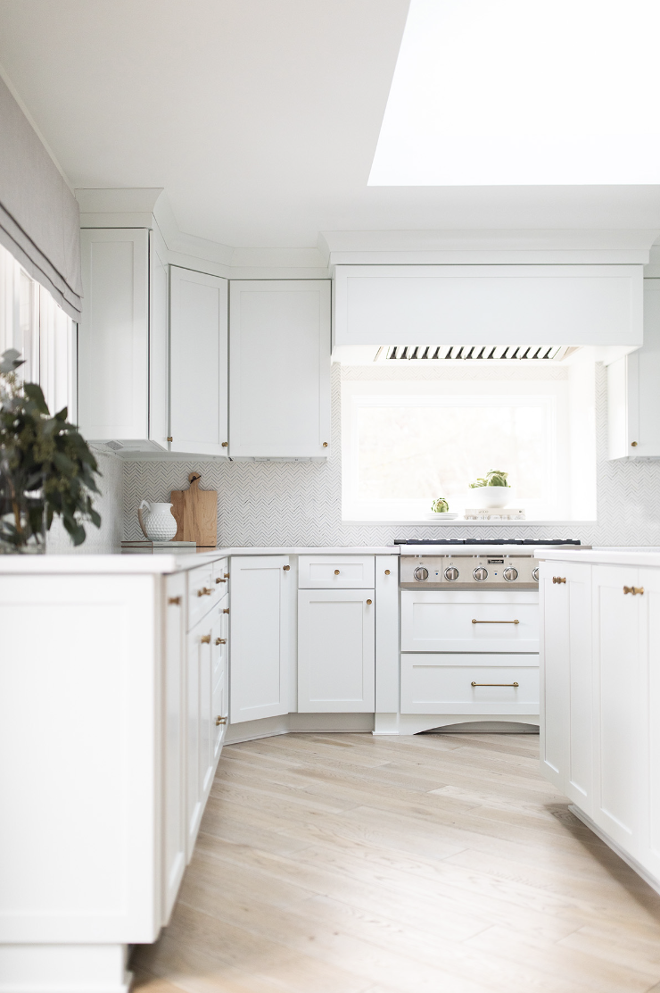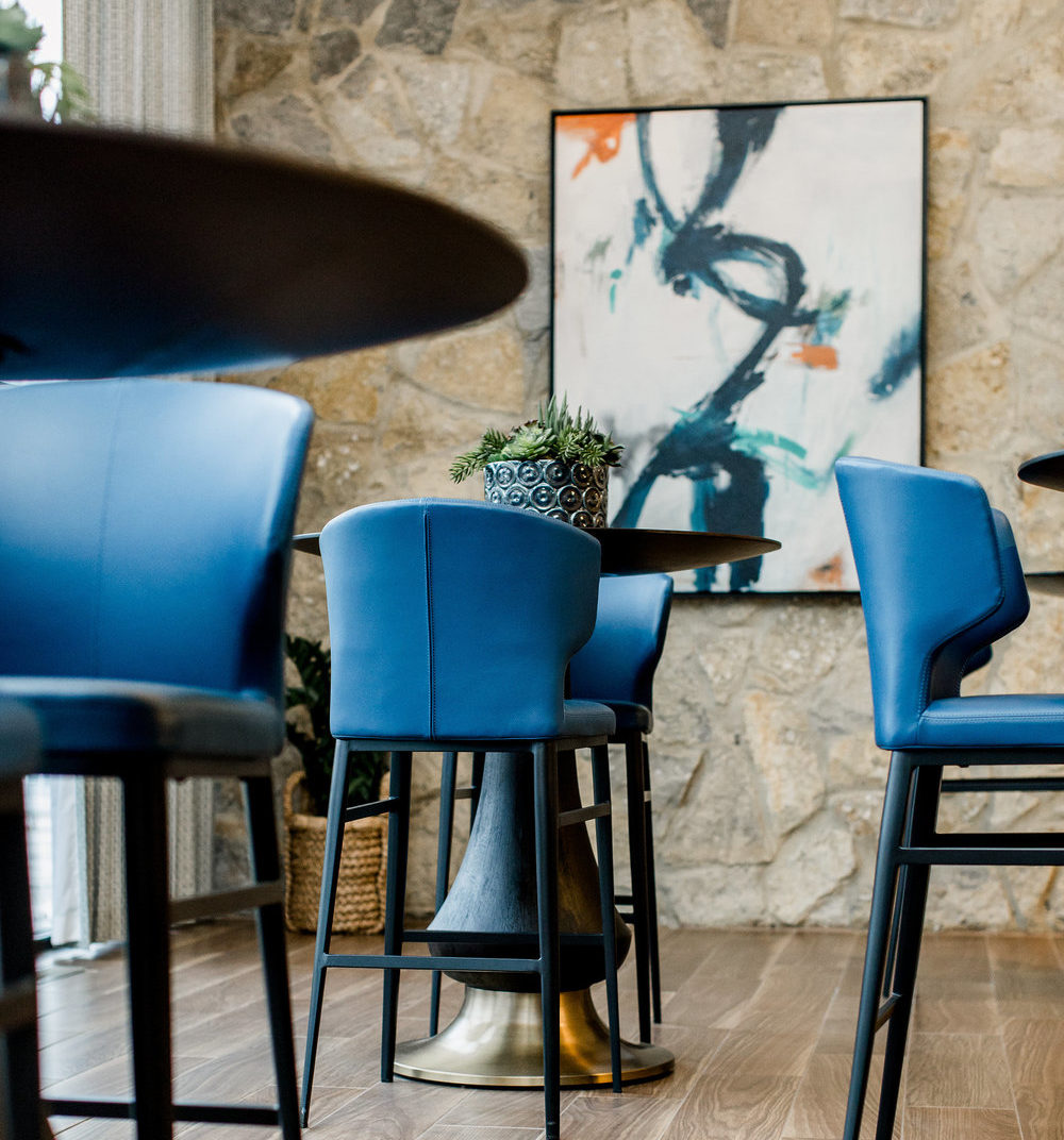
When we were approached by the new owners of the Worthington Gardens complex (located between historic Clintonville and Old Worthington) to totally gut and renovate the property’s clubhouse, we were thrilled to take on this incredible project. The original building had incredible potential. From its vaulted ceilings to its incredible natural stone accent walls, there were so many good things off of which to build. Of course, the decades old building needed much more than a face lift.


Our client wanted to incorporate the original stone wall and wood ceiling into the updated design and wanted to honor the midcentury feel of the original architecture. So, we took inspiration from that and created a midcentury inspired space, with a modern edge.


One of the best features of the existing structure were the floor to ceiling windows that wrapped around the building. The whole room is flooded with natural light, throughout most of the day! We wanted the space to feel spacious and open, and the windows certainly helped with that. We created a grid pattern for the glass that had a nice, midcentury vibe to it as well. The clean, linear lines were a great contrast to the rugged stone walls the windows broke up.


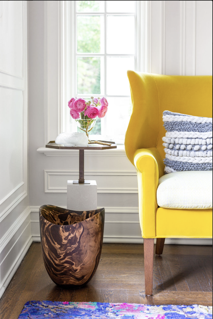
While we wanted to make sure the common areas of the clubhouse felt spacious and open, we also wanted to create distinct living areas that would direct the flow of the room. We were excited that our client wasn’t afraid of vibrant colors. We used oranges, blues, and yellows to signal the beginnings and ends of specific living spaces. Using color, well appointed textiles, and intentional placement of furniture, we succeeded in creating multiple, discrete spaces within an open floor plan.


Full scale remodels and renovations are our favorite kinds of projects to take on. We love collaborating with our clients to create new spaces, drawing from the existing structure and drawing inspiration from its history and architecture. We had amazing partners in our client on this project, especially. They had a fun vision, wanted to use color and pattern to set their space apart, and let our imaginations run wild!
Thanks so much for reading! If you liked what you saw here, be sure to follow us on Instagram for weekly blogs and behind the scenes content! What did you think of this project? Let us know in the comments!